
Why Branding Colors Matter
Nature is no stranger to using branding colors to attract their “target audience.”
When you think of advertisements you might think of marketing ads, but color is such a powerful tool that animals have been deploying it to “advertise” their own agendas and personalities since the beginning of time.
From attracting mates to warding off predators, animals sure know how to brand themselves.
If you’re a flower and you want to rub shoulders (or petals) with a butterfly you really should brand yourself with red, yellow, orange, pink and purple blossoms.
If you’re a Golden Poison Frog (the most poisonous animal on the planet), you don’t blend in and hide, no, you advertise.
Rather than camouflaging they stand out using a signal called aposematism — basically the equivalent of a flashing sign saying “Don’t eat me, I’m poisonous.”
Talk about a powerful brand message! Bold colors and patterns tell predators to dine elsewhere — seems these amphibians really know who is and isn’t in their target market.
Thanks for the warning, Mr. Frog.
If understanding color doesn’t come as naturally to you follow these steps:
- Delivering The Right Message
- Colors And Emotion
- Color And Memory
- Define Your Brand Personality
- Understand Color’s Effect On The Brain
- Know Your Audience
- How To Build A Color Scheme
- Types Of Color Schemes
- Create A Mood Board
- Consistency Is Key
- Repetition And Association
Delivering the Right Message
When branding is done right it benefits everyone because it conveys the right message.
Take the frog, for example, its color display ensures it doesn’t get eaten and its predators don’t get a “healthy dose” of poison with their meal.
So you see how even nature knows how branding colors benefit both the company and its audience by conveying the right message.
Colors and Emotion
When you hear the word, love, how does it make you feel? What emotions does it conjure within you?
Chances are it conjures up images and emotions much stronger than a phrase like “battery charger” or “roofing contractor.”
When developing a brand you must remember that your brand is your reputation, your story, your message. However, you can’t tell the entire life story in your logo, your website, or on your packaging.
So what do you do?
You have to cultivate a strong emotional connection with your audience and you can do this with some visual shorthand.
Just as different words evoke different emotions, so do colors — and choosing the right ones can make all the difference.
Emotions are powerful motivators and strongly influence our decisions. We often think decisions are made through rationalization and logic, but in fact, it is more about how we feel.
In fact, Neuroscientist, Antonio Damasio, did a study on people who had damage to the portion of the brain where emotions are developed. He found they all shared something in common — not only could they not feel emotions, as a result, they were unable to make decisions.
So while spending time developing your brand and brand colors may feel irrational, that feeling may be the very reason it’s the best thing you choose to do.
Color and Memory
Not only do emotions drive decision making, but they can actually make you more memorable.
Having distinct branding colors helps get and retain brand recognition.
If someone says Tiffany Blue can you picture the color?
Can you identify the brand by this phrase: “What can Brown do for you?”
Could you identify the battery if I said, “You can’t top the copper top.”
Using colors that get you recognized and create associations with your brand can evoke strong emotions that make you more memorable to your audience.
So how do you create brand recognition using color, you ask?
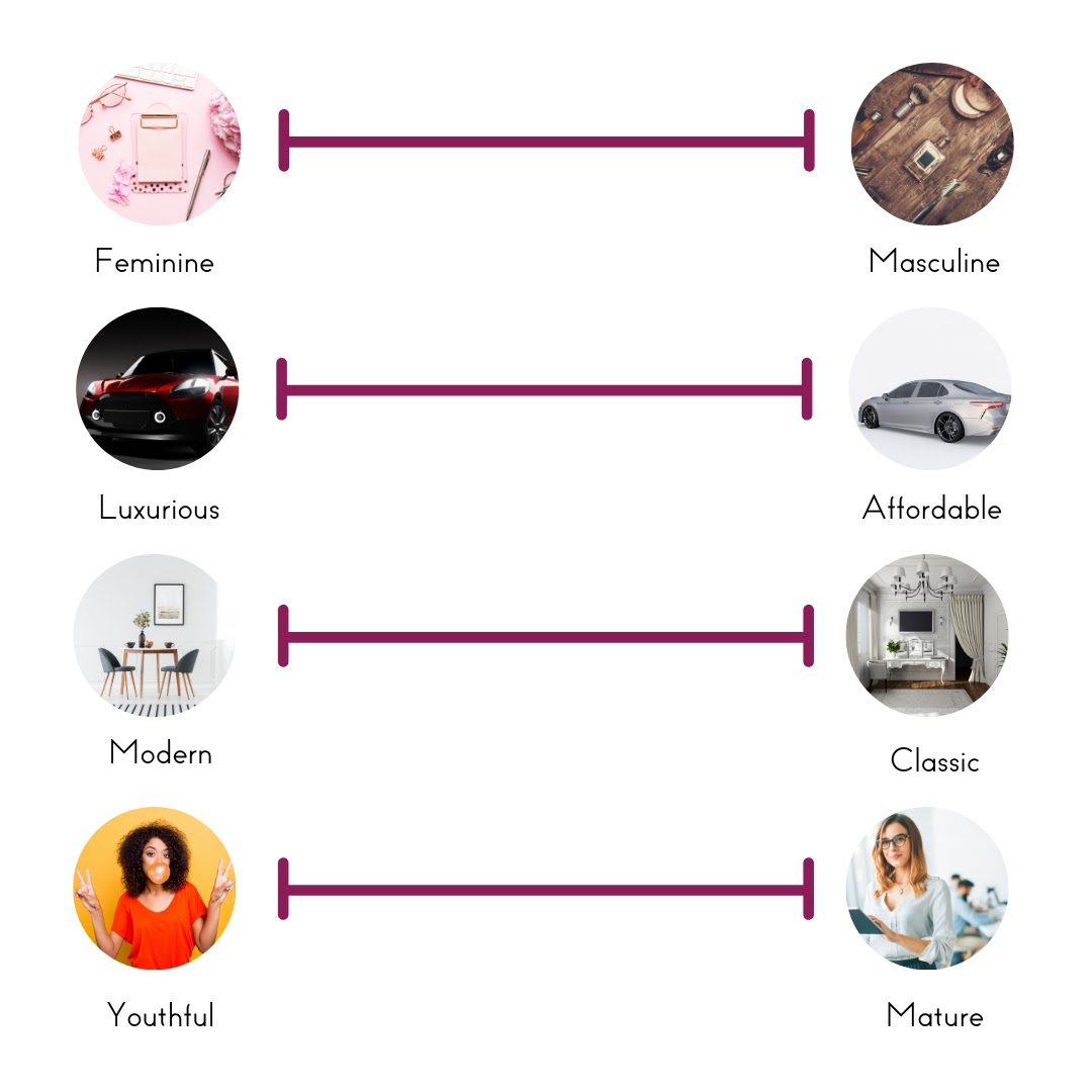
Define Your Brand Personality
Tone is important for creating the right look and feel for your brand’s personality.
Ask yourself where you fall on the spectrum of these following Brand Personality Characteristics:
Understand Color’s Effect on the Brain
As we mentioned, emotion is tied closely with decision making, so it’s important to understand the psychology of color and know its effects on your audience.
Use color psychology and theory to choose the right colors for your brand and convey the right message.
How Color Tricks the Brain
You now know color can convey emotion and those emotions can improve memory retention, but did you know that color can also convey a message by tricking the brain?
It’s so powerful that when people were given samples of vanilla yogurt with food coloring added their brains were fooled into thinking it was a different flavor depending on the color of the yogurt.
And when expert wine tasters were given a white wine — served once with red food dye and once without — they perceived the taste of the “red” version as if it were a red wine.
Color can actually make our brains tell us a different story, so choosing the right color for your brand can ensure it tells the story you want to tell.
Color Psychology
So if color has a powerful effect on the brain, what does each color mean?
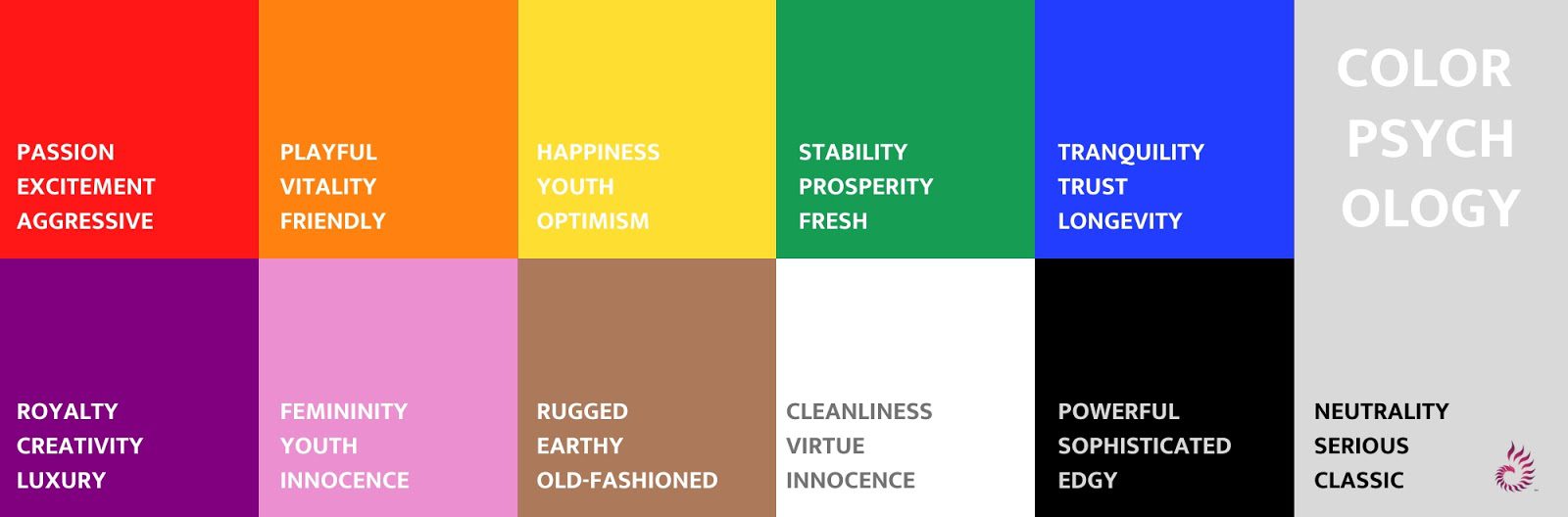
Red
Passion, Excitement, Aggressive, Commanding.
Fun Fact: In fact, the color red is so powerful at evoking aggression that a Stanford study has shown that teams wearing red are more likely to win.
You read that right, a team can increase their chances of winning simply by their team’s color choice.
Put my money on red!
Orange
Playful, vitality, friendly.
Yellow
Happiness, youth, optimism
Green
Stability, Prosperity, Growth, Natural, Fresh
Blue
Tranquility, Trust, Longevity
Purple
Royalty, creativity, luxury
Pink
Femininity, youth, innocence
Brown
Rugged, earthy, old-fashioned
White
Cleanliness, virtue, health, simplicity, innocence
Black
Powerful, sophisticated, edgy, luxurious, modern
Gray
Neutrality, subdued, classic, serious, mysterious, mature
Remember the effect your brand colors present can vary depending on your style, the hue, tone, and combinations of the colors you choose.
Don’t forget the context of your business also factors in when determining your brand colors. For example, that’s why red is effective for fast food establishments, amusement parks, and romantically based business types, but provides the wrong psychological cues for financial, legal, and most medical establishments.
Know Your Audience
If you are a company with ambitions of reaching a global audience you need to understand the cultural perception of your global customer base.
Have you ever wondered why many of the world’s largest banks don’t use green in their branding? After all, green is the color of money, right?
Well, only if you use US currency.
A culture’s language can affect how they see and perceive color.
For example, Greek speakers have two separate terms to describe the color blue, yet after living in the UK, where the color is described by the single term “blue”, they are less likely to distinguish between the two.
And, while many Westerners are not a fan of using yellow, because they consider it too harsh and overpowering, consider in some Asian countries it adorns Buddhist temples and is revered as a sacred color.
Perhaps most surprisingly, white is generally associated with “light, bright, and pure” (a popular choice for many brides) in Western society, but cross-culturally it’s more known for mourning, redemption, innocence, or surrender.
How to Build a Color Scheme
Now it’s your turn.
Putting all this together may seem overwhelming, but simply start with three colors.
Choosing Your Three Colors
You’ll need a Dominant Color, Accent, and Neutral color to begin.
Dominant: What your brand is associated with.
Accent: Brings attention to things such as buttons or text.
Neutral: Adds some background flavor.
Picking your Dominant Color
After picking your three main colors, consider which one is most important to convey your brand’s personality, message, and identity.
Consider what the most dominant trait of your brand’s personality and how your target audience will perceive it.
Picking your Accent Color
Make sure it pairs well with your base color, matches your brand personality, and appeals to your audience.
Picking your Neutral Color
Since this is often your background color it should be subdued so as not to draw attention to itself.
If you want to avoid using white some common choices are grays, beiges, or off-white. You can also choose to use black, but it can be a very powerful color that can change your brand’s overall tone if you’re not careful.
Black and white can be used with any color palette and don’t necessarily need to be added to the palette itself if you prefer.
Mind the 60-30-10 Rule
A common rule designers use is the 60-30-10 rule.
Basically, when choosing your three colors use the ratio of 60%, 30%, and 10% for distribution.
Your Dominant Color should take up 60% of your scheme’s use, your accent should take up 30%, and your neutral 10%.
This doesn’t mean that your website needs to be filled with your Dominant Color. In fact, using color for very specific purposes makes it more effective. It simply means that at first glance, your dominant color is the main color that stands out in any sort of design.
Remember, while this is seen as a “rule,” rules can be broken.
The 60-30-10 rule is best to keep in mind when applying your color scheme to a design, not the overall aesthetic itself.
Do what feels right for your brand, but above all be consistent.
Types of Color Schemes
Choosing a good color scheme can help set the tone for your brand and ensure the best experience for your audience.
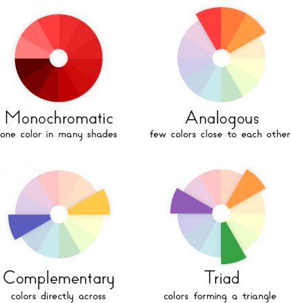
Monochromatic
This type is great when you want to focus attention on a single personality trait. Try and differentiate the hues so that they are visually distinct.
Analogous
When colors reside next to each other on the Color Wheel they create a harmony, but much like Monochromatic styles these types can often look very similar and not stand out as much as other color schemes.
Complementary
Colors that complement each other come from opposite sides of the Color Wheel. While opposing each other they actually bring out the other color.
Triadic
These schemes pull from the three different sections of a Color Wheel. The challenge is to ensure the colors pair well together.
To test out certain colors you could try using Canva Color Palette or
Coolors Color Generator to get you started.
Create a Mood Board
Color palettes can be deceiving.
Test out your colors with a couple applications.
A good place to start is creating a new board on Pinterest and pin all the initial ideas that feel right to the brand’s identity.
Take a step back and find which of your selections best fit your brand, then piece them together in your own mood board compilation — keeping in mind the 60-30-10 rule.
Consistency is Key
Think about any big brand.
Imagine if McDonald started using green rather than red?
Or UPS stop using brown?
Let’s take this a step further…
What colors do you think of when I say these holidays?
Halloween
Christmas
Easter
Fourth of July
How about when you think of the school colors of your Alma Mater? What would happen If they suddenly stopped using them?
Oh, the humanity!
Interestingly enough, I really disliked our school colors at Oregon State — orange and black — because it always made me feel like it was Halloween.
Consider all the places that you might use color:
Logo
Social Media
Packaging
Website
Advertisements
Being consistent develops a strong association with those colors and as a result, you create a more memorable experience for your brand.
To ensure consistency make sure you know the exact color number of your chosen brand colors so that their use is consistent across all your platforms.
Picking a random light blue and telling your marketing department to use light blue is not specific enough and will result in inconsistent results.
Being consistent is the best way to create brand awareness.
Repetition and Association
Repetition is vital to creating associations, therefore consistent color use will actually create stronger neurological associations with your brand.
You might have heard of the Marketing Rule of Seven which states that any prospective buyer needs to be exposed to your message at least seven times before they take action to buy your product or service.
According to psychologist, Gretchen L. Schmelzer, Ph.D., six exposures to learning something new leads to stronger activation in your brain’s learning and memory center.
So if you want to get your audience’s attention make sure your color is consistent and use it repeatedly to create a strong association with your brand.
Now you’re on your way to brand recognition using color.
Summing it all up
Brand colors can help you to deliver a message and create brand recognition.
Colors evoke emotion which helps guide your audience’s decisions and makes you more memorable.
When it comes to personality, knowing the psychology of color and how creating the right color scheme can establish a brand personality that resonates with your audience.
To get started choose your top three colors to get started, choose a color scheme, and test them by making a mood board.
Be consistent because repetition creates stronger neurological associations with your brand.
So whether you want to attract the right customer or ward off your competitors, take a book out of nature, and use color to brand yourself.
Need help choosing your Brand’s Color Palette?
I’d Like to Hear from You
What’s your #1 takeaway from today’s article? Or what’s one question you have about what you read? Either way, I’d love to hear what you have to share so leave me comment below and let’s chat.
2 Comments
Key Takeaways
Brand Color FAQs
Why are Branding Colors important?
So what do you do?
You have to cultivate a strong emotional connection with your audience and you can do this with some visual shorthand.
Just as different words evoke different emotions, so do colors — and choosing the right ones can make all the difference.
How do I choose a Brand Color?
Feminine vs Masculine
Luxurious vs Affordable
Modern vs Classic
Youthful vs Mature
Know your audience and how they will respond to the personality profile you’ve created.
How many Colors should a Brand have?
Dominant: What your brand is associated with.
Accent: Brings attention to things such as buttons or text.
Neutral: Adds some background flavor.
How do I choose a Color Scheme?
Monochromatic: This type is great when you want to focus attention on a single personality trait. Try and differentiate the hues so that they are visually distinct.
Analogous: When colors reside next to each other on the Color Wheel they create a harmony, but much like Monochromatic styles these types can often look very similar and not stand out as much as other color schemes.
Complementary: Colors that complement each other come from opposite sides of the Color Wheel. While opposing each other they actually bring out the other color.
Triadic: These schemes pull from the three different sections of a Color Wheel. The challenge is to ensure the colors pair well together.

![Building Brand Recognition Like a Pro [Step by Step Guide]](https://benucreations.com/wp-content/uploads/2020/08/Benu-Creative-Branding-and-marketing-strategies-building-brand-recognition-step-by-step-guide-400x250.jpg)
![Crafting An Authentic Brand Personality Your Customers Will Love [ 12 Personalities ]](https://benucreations.com/wp-content/uploads/2021/12/Brand-Personality-Types-400x250.jpg)

![How To Do A SWOT Analysis [Free Template]](https://benucreations.com/wp-content/uploads/2020/12/Benu-Creative-How-to-Do-a-Competitor-Analysis-How-to-do-a-SWOT-Analysis-Branding-and-Marketing-Strategies-How-to-Brand-Your-Business-Building-Brand-Awareness-Building-Brand-Recognition-400x250.jpg)
My homes in Oregon reflect my engagement with color. Feng shui guides me a bit, and no compromise led me to get +/- 33 samples to paint on outside slats—I can show you the results—before we painted our house. Some symbols are universal for international communication —e.g., across languages and cultures; but what about white in the US versus white in China (I digress here). Color is a think outside the box to find a clear message, maybe?
We would love to see that, Molly! Thinking in color is certainly thinking outside the box. Interior design is really important to think about when your home or office is showcased as part of your brand. Honestly, even if your home isn’t a public part of your brand sometimes just knowing how color will affect mood and productivity can play huge part in your planning. Thanks for sharing. 🙂