
From the earliest moments of our lives words become a playground of meaning.
Within the first six months most babies can begin to distinguish the basic components of their native language.
By age five children begin to identify letters and can extract meaning from words as they begin to read.
We are exposed to countless words with various levels of meaning every day. We see them everywhere – from books, to road signs, to billboards, to t-shirts, to websites, to foreign film subtitles (for us cinephiles), and so much more.
In fact, if you were to visit 200 web pages in a single day (which is not uncommon to do) you would see an average of 490,000 words. To put this in perspective, War and Peace clocks in at only 460,000.
That’s a lot! I mean, just look at that thing!

When it comes to branding, conveying the proper message is about much more than the words we craft, it’s about the meaning we create and the actions they evoke in our audience.
So how do we make words stand out?
How do we guide readers and make meaning with the letters we choose?
Today we’re going to talk about:
- Understanding Semiotics (Meaning Of Symbols)
- Creating Meaning
- Gee, That Font Has A Great Personality
- You Better Not Take That Tone With Me, Font
- Getting Started With Your Branding Fonts
- Make It Legible and Accessible
- Keep It Legal
- Understanding Font Hierarchy
- Versatility
- 4 Character Test
- Font Pairing
- Serif vs Sans Serif
- Take Your Font For A Test Drive
- Get Feedback
- Finalize
Understanding Semiotics (Meaning of Symbols)
When you clicked on this you probably weren’t expecting to get a philosophy lesson, were you?
Well, let’s get to waxing philosophical, shall we?
Semiotics is essentially the study of signs and symbols with relation to their intended use and interpretation.
While the concept of Semiotics refers more directly to how we perceive the meaning out of images and symbols — letters, and the fonts they inhabit, are a type of symbol as well.
Creating Meaning
To put semiotics more plainly, when creating meaning you have two parts that a “sign” is composed of:
The signifier – the form a sign takes (in this case letters)
The signified – the concept being represented
Words are just letters (symbols) assembled together. They don’t have meaning until we assign meaning to them.
The letters “c-a-t” do not make the animal we call cat, we have assigned that combination of letters that meaning; therefore, when one sees that combination they picture in their mind the cutest things ever.

Just look at them! <3
But I digress…
What you need to understand is that while we create meaning out of words, the types of fonts we apply to our words also create meaning as well.
For example, how is it that you know:
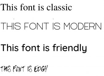
this is calm
AND THIS FEELS LIKE IT’S BEING SCREAMED AT YOU
How we use typography is not simply about choosing something that looks pretty or picking something we enjoy looking at — it’s about creating subtext and psychologically or subconsciously conveying meaning to our audience.
When we bring a person to our website, our ad, or our product description they need us to guide them.
We cannot expect the description alone to hold the meaning. Instead, how we script it — what gets italicized, bolded, colored, or capitalized — creates a whole new layer of meaning that guides our understanding of the text.
Remember, color and font-weight (bold vs italics) should signify an action or some kind of subtext to what is being viewed.
After all, which do you want to click most?
Click Me or Click Me
Gee, That Font has a great personality
We’ve talked extensively about knowing your mission and values and how those help construct the proper personality for your brand.
Once you understand what personality and tone your brand is going for, you then have to know how to apply the right typeface and fonts to create that personality.
As a side note, let me define the difference between typeface and font.
A typeface is the name given to a family of fonts (such as Arial), and font refers to the styling of that given typeface — weights, widths, etc. (such as Arial Regular, Italic, Bold, etc.)
Now that we’ve distinguished between those two concepts, let’s unpack how fonts within a given typeface can convey a personality.
Look at these two shapes:

If I asked you which one was named Kiki and which was Bouba, which would you say is which?
When UCSD scholars VS Ramachandran and Edward Hubbard asked a group of participants to choose, 95% named the left object kiki, and the right object bouba.
Look at these two fonts:
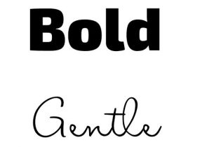
As you can see, when we apply the concept of semiotics to typography based on shape, size, and weight, this applies a certain personality to those words that go beyond their originally defined meaning.
You better not take that Tone with me, Font
A big part of a person’s personality is their tone of voice, intonation, and manner of speaking.
This is why it can be difficult to discern a person’s intention when reading a text or email.
While the percentage of verbal to non-verbal communication cannot be quantified as we once thought, we can still observe the effects of how the transmission of a message without emphasis, tone, and volume can lose some of its meaning. This often causes the recipient to commit an incorrect act not intended by the sender.
Take, for example, these three phrases:
He found it
He found it
He found it
See how the intonation changes the meaning.
The type of font you chose should reflect the type of tone you wish to convey to your audience.
Knowing how the font choice can create an intonation and tone deepens the layers of meaning to the words your brand uses.
Getting Started with your Branding Fonts
So what do you do with all this information? How do you get started?
Remember, typography reflects both the personality and tone of voice for your brand.
Just as a person’s voice changes to put emphasis on certain words, the styling of typography can do the same.
When done correctly, typography just “feels right.”
To get started finding the perfect typeface for your brand begin by discerning the personality of your brand and research a variety of choices for potential fonts that match your brand’s personality.
Some great resources:
Make it Legible and Accessible
Some typefaces and font styles might be difficult for those with dyslexia, which is estimated to be around 20% of the population.
It’s really important to strike the right balance between finding a typeface to match your brand personality and still be accessible to those who may struggle with dyslexia, but when done right you can create a more inclusive platform for everyone.
Layout and font size can have a real effect on your audience as well, and it’s important to consider because it can help or hinder your reader’s ability to read your message. This Dyslexic Friendly Style Guide can help get you started.
Dyslexie is a free font that you could use, but you could also consider one of these as well.
Also, ask yourself what other ways you are supporting the information you provide other than text.
People tend to learn better when a Multisensory learning approach is taken. This is the technique that engages multiple senses for a better learning experience rather than a single sensory modality.
Don’t rely solely on the written word. Instead, try to incorporate video, infographics and icons to help fill in the information and give multiple pathways to approach your message.
When you employ these into the supported platforms to deliver your message you’ll not only provide better accessibility but also reach a broader audience.
Keep it Legal
Above all, the fonts you choose should be legible and free for commercial use or you should purchase the appropriate license to use them legally.
It is important to note that not all fonts are free to use for commercial use, so it is important that during your visual search you look at the licenses for each font and see which offer commercial-use licenses.
Fonts with an Open Font License (OFL) are free and can be used in just about anything, short of reselling. Google Fonts is a good place to look if you’re searching for this type of license. However, many fonts may still have restrictions outside of personal use so it’s important to check each font individually and never assume you can use it commercially.
You may even find fonts that are free for personal use but require a paid license to allow creators access to that font for commercial use.
If you desire to have a font that is unique to your brand, seeking out those that require a paid license can be beneficial since paying for a font can be a barrier to entry that many others aren’t willing to pay.
If figuring out licensing is a concern of yours and you really want your font to have your unique mark, consider creating or having someone create a customized font.
Fontself is a brilliant tool that takes a lot of the tedious work out of font creation, letting you have a one-of-a kind font that you can use any way you like. If you have a designer create a custom font for you, read your contract carefully so you know who owns and has the rights to the font.
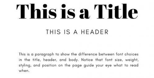
Understanding Font Hierarchy
We suggest choosing three fonts to start: title, body, and accent
Make sure all three fonts work in harmony together and reflect the aesthetic of your brand.
Choose which fonts will be used for your title, headers, and body copy.
Styling (bold, italics, color, etc.) can also help direct the reader’s eye.
Choose which sentence-case and size of font you feel work best whether it be UPPER CASE, Title Case, Sentence case, or lowercase.
Note that UPPERCASE IN A SENTENCE can feel too strong and loud, almost like someone shouting, whereas the extra emphasis can work well in a header.
Versatility
Don’t forget to test the versatility of the fonts you choose.
It isn’t guaranteed that each typeface you choose will have a variety of font families and font weights (bold, italic, etc.).
Even if you do find a versatile typeface, still test out its fonts by putting them to use. What looks good in the demo may not actually work well in your brand presentation.
4 Character Test
To test fonts that you think could work for your brand, type an uppercase letter “i”, lowercase letter “l”, the number one “1” and an exclamation point “!”. This is a quick test to gauge the legibility of the font and whether to continue pursuing it or not.
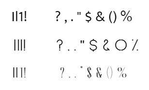
If these letters look too similar, it may not be the right font. Or, after testing it with your own content, you decide if its shortcomings do or do not hinder your use of it.
Finally, also look at the common punctuation marks and make sure their styling fits your brand as well.
Font Pairing
As you’re searching for that perfect font, remember that your two to three fonts need to work in harmony together. This will be most noticeable when choosing your title, header, and body font.
A quick solution is to simply use a font from the same typeface. For example, Quicksand Bold could be the title font and Quicksand Regular could be the body font.
For most though, having variety is more appealing as it provides additional character and greater flexibility.
For a quick tip, pair a serif font with a sans serif one.
Also ensure the font styling (capitals, flourishes, highlights, etc.) marries well with the font that it’s paired with and isn’t cacophonous.
Serif vs sans serif
A good rule of thumb is to use serif fonts for titles and sans serifs for body copy, such as the title/header/body example above.
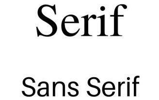
Sans serifs are typically easier to read and work well online.
Serif fonts have little “kickouts” or “feet” that can create a classic look to them and work well for a scholastic look and in print.
Now Take your Font for a Test Drive
Now pick a few words and phrases in the fonts you’ve chosen. Your mission statement is a good place to start. If you haven’t drafted one yet, we have a step-by-step guide on drafting a mission statement that’s authentic to your brand.
Put them in a hierarchy structure and see how they look and feel.
Do they pass the 4 Character Test?
Is it hard to tell the difference between a comma and a period?
Does a font feel too informal when you need to look impressive and professional?
If some of these issues arise, it may be time to go back to the drawing board.
Get Feedback
Ok, you’ve found the perfect group of fonts: they’re stylish, they look good together, they have all the symbols and special characters you need, and they look amazing on your business card mockup and logo.
But before you dive in and apply your fonts everywhere, get some feedback.
Although you may love your font choice, does it truly evoke the character of your brand? Does it resonate with your target audience?
You won’t know this because you’re looking from the inside out. Time for some other perspectives.
Get a few samples of your marketing materials to test on a variety of age groups. It could be a business card, it could be a packaging mockup, or it could even be a bigger section of text such as some website copy.
Ideally, get feedback from people who will give you an objective opinion (not just family and friends) and, more importantly, who fits into your target audience.
These people will be able to tell a) if your font is legible and b) if it fits their expectations of your business.
Make sure to test at different sizes and scales, on print material and online.
Also, consider the impact of color and design and how those elements could affect the viewer’s perception of the fonts. To start, have everything be in simple black and white. As you narrow down your font choices, utilize color and spacing to bring attention to certain words you want to emphasize by catching the reader’s eye.
Finalize!
Once you’ve thoroughly vetted your fonts, it’s time to deploy them consistently across your branding!
Be consistent not only in your title, headers, and body choices, but also in how you style your fonts.
Are hyperlinks a certain color?
Do you left-align or center align your titles?
When can and can’t color be used?
With the brain already having to make multiple decisions a day, give it some breathing room and create a guideline on how to appropriately use your fonts to convey the correct brand message. This is typically seen in a Brand Guide or a Style Guide.
The Wrap Up
Phew! That was a lot of work!
Whether you were testing a variety of fonts for cohesion with your brand or taking a leap and creating your own, finding the perfect group of fonts for your brand is no small feat.
Not quite convinced you have them narrowed down yet? Let’s do one last check:
1. Only have two to three fonts and designate them for use as a title, body, and accent.
2. Make it legal – do you have the appropriate licenses for your intended use? Remember, Open Font Licenses are the most flexible if you’re looking for a free font with commercial use.
3. Does the tone of the fonts match the tone of your brand?
4. Are your fonts legible and appealing to your target audience? Does it pass the 4 Character Test?
5. Are your fonts flexible? Do they have bold, italic, thin and thick variations? Trust us, better to have them and not need them than vice versa.
6. Do they pair well together?
7. Do you know how to use your fonts? Hierarchy, styling, sizing? Release your brain from having to carry it around and put it all in a Brand Guide (or at least a document of some sort).
Got it all checked off? We knew you would. Having nice fonts is like your brand getting a new hairstyle. Put them to good use!
Need help choosing Brand’s Fonts?
I’d Like to Hear from You
What’s your #1 takeaway from today’s article? Or what’s one question you have about what you read? Either way, I’d love to hear what you have to share so leave me comment below and let’s chat.
Key Takeaways
Brand Typography FAQs
What is Brand Typography?
How do I choose what fonts best represent my brand?
It is important to understand the mission and values of your brand. Starting from here will help you develop the tone and personality you wish to convey. Once you understand which personality traits will resonate best with your desired audience pick a pair of fonts that best showcases those traits. Always check the licensing of each font to ensure you can use it commercially.
How can fonts create Brand Personality?
How can my font choice create a unique Tone of Voice for my brand?
How should I pair fonts together?
A quick solution is to simply use a font from the same typeface. For example, Quicksand Bold could be the title font and Quicksand Regular could be the body font. For most though, having variety is more appealing as it provides additional character and greater flexibility. For a quick tip, pair a serif font with a sans serif one.
Also ensure the font styling (capitals, flourishes, highlights, etc.) marries well with the font that it’s paired with and isn’t cacophonous.

![Building Brand Recognition Like a Pro [Step by Step Guide]](https://benucreations.com/wp-content/uploads/2020/08/Benu-Creative-Branding-and-marketing-strategies-building-brand-recognition-step-by-step-guide-400x250.jpg)
![Crafting An Authentic Brand Personality Your Customers Will Love [ 12 Personalities ]](https://benucreations.com/wp-content/uploads/2021/12/Brand-Personality-Types-400x250.jpg)

![How To Do A SWOT Analysis [Free Template]](https://benucreations.com/wp-content/uploads/2020/12/Benu-Creative-How-to-Do-a-Competitor-Analysis-How-to-do-a-SWOT-Analysis-Branding-and-Marketing-Strategies-How-to-Brand-Your-Business-Building-Brand-Awareness-Building-Brand-Recognition-400x250.jpg)
0 Comments